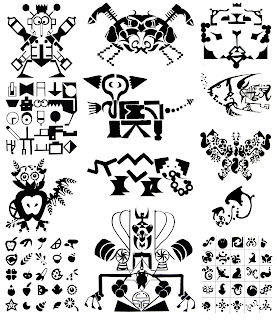
In the above, students were asked to find a vocabualary of 25 simple shapes. Then using a grid, they had to use some or all of these shapes to draw something concrete such as an object, animal, etc... and then the first letter of the corresponding word. By using the same graphic vocabulary for both, this allowed them to be fairly consistent. The grid was introduced as a design tool, as it is very much used in swiss graphics for composition purposes. Needless to say that the letters and chosen objects or animals had to be easily recognisable, which wasn't always the case. Drawing with shapes isn't as easy as it sounds!!!
The object of this project was fairly similar to the previous, which was to design with shapes. On a grid of a certain size, students were asked to design a composition on the entire surface with simple black shapes; by doing so they noticed that while designing with black shapes, new white ones appeared. The idea here was to realize that white is as important as black! It becomes a second color and not just a background for the overall design. Learning to observe white negative shapes is essential when studying typography later on during the year. After finishing the first part of the project, students were also asked to design an object or animal or what not, with the same shapes as well as the initial letter of the word. They could use the composition as a background for the letter. Although these two projects were similar, the end result was not especially the letters which were drawn in Helvetica.


Aucun commentaire:
Enregistrer un commentaire