samedi 7 juillet 2012

TEACH GRAPHIC DESIGN

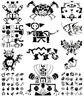
The above was a logo designed by one of my students for the school I teach at, here in France. My goal is not to promote it but since it is hardly readable, I thought it would be a good visual to start out with. Nice eye-catching design. The question is: does it work? Following are various black and white projects done by my first year, foundation classes over a span of about 15 years.


The above is my usual, very first project of the year. Students are asked to work around the arrow symbol. The idea is to design new shapes for this universal symbol, and eventually repeat them in a pattern in the shape of a square or circle. The goal is to work with black and white, to start fiddling around with positive and negative shapes in a creative way. I usually blow my gouache demonstration more or less on purpose, which from the start makes the class realize that nobody's perfect, not even the teacher!!! It also allows me to show what not to do for the final renderings, as this project is to be done as neatly as possible in solid flat surfaces of black gouache. I expect hand-rendrered, tight comps from the start! Needless to say, students are not permitted to use photoshop or the likes at this stage of the game. Normally there shoudn't be any fine line work, only surfaces, which means that thick lines can however be used.


vendredi 6 juillet 2012


In the above, students were asked to find a vocabualary of 25 simple shapes. Then using a grid, they had to use some or all of these shapes to draw something concrete such as an object, animal, etc... and then the first letter of the corresponding word. By using the same graphic vocabulary for both, this allowed them to be fairly consistent. The grid was introduced as a design tool, as it is very much used in swiss graphics for composition purposes. Needless to say that the letters and chosen objects or animals had to be easily recognisable, which wasn't always the case. Drawing with shapes isn't as easy as it sounds!!!


The object of this project was fairly similar to the previous, which was to design with shapes. On a grid of a certain size, students were asked to design a composition on the entire surface with simple black shapes; by doing so they noticed that while designing with black shapes, new white ones appeared. The idea here was to realize that white is as important as black! It becomes a second color and not just a background for the overall design. Learning to observe white negative shapes is essential when studying typography later on during the year. After finishing the first part of the project, students were also asked to design an object or animal or what not, with the same shapes as well as the initial letter of the word. They could use the composition as a background for the letter. Although these two projects were  similar, the end result was not especially the letters which were drawn in Helvetica.

jeudi 5 juillet 2012


Here students were asked to design a large black and white mandala, again using a vocabulary of simple shapes on a big circular construction. Like a pie cut in 5, 6, 8 or 9 pieces, each piece had to be identical. It was essential to use any tool necessary such a compass, triangle, protractor... and a ruler of course! Right from the start, students are asked to buy frisket paper to be cut as a stencil and a sponge roller to do as clean a job as possible.


The object here was to come up with 49 different pixel designs. Students were again introduced here to the use of the grid and shown differents types of grids. The purpose was purely graphic but the number was important in order to force everone to find as many solutions as possible. Beginners have the  funny tendancy of being satisfied with only one idea, which obviously is not enough for someone supposed to be very creative!!! To me, designing is essentially playing and fooling around with shapes; searching for new ideas and compostions is part of the fun. If there isn't any fun or pleasure in the process, it will show and the end solution runs the risk of being bland if not just plain boring. The course is built up to in a very playful manner even though it is also a lot of hard and time-consuming work. Laughing, exchanging ideas, opinions, technical skills is highly encouraged. When thinking and searching for new ideas, it is one case where "more is NOT less". The more ideas, the better. 

mercredi 4 juillet 2012


Before diving into the nitty gritty of Typography, we usually start out working around just one letter alone. I usually give a very brief and quick talk around the basics of typography. As in the case of the first arrow shown previously, students were asked to choose a letter and find many ways of designing it. Another exercise was to make a metamorphosis of the letter in Helvetica by turning it progressively into an animal like an animated film.

In the above examples, letters were used as motifs and repeated in a pattern. As always, negative space is as important as the positive.


In these cases, students were asked to play with their 2 or 3 initial letters, playing with shapes similar to the letters themselves. Looking for analogies and similarities, including a design in another shape and ending up with something that could be used as a personal logo. Again, a quick introductory talk on logos and symbols, crests and the likes is usually given, on this occasion.

Although the end results remind me of Vasarely's op art, the initial idea for these projects differed. The point was to work on a large grid of small squares, on a large sheet of paper, 55cm by 60cm. Each square was filled in partially with black. The amount of black space in each square, determined the value of gray in that particular area. The more black, the darker it became. The shapes used in the squares could be simple squares, triangles or other and could evolve progressively throughout the surface. White, was to be used sparingly. Students had to do 3 pencil sketches before choosing the best composition, for the final gouache rendering, keeping in mind the varying degrees of gray. The end results seem to shimmer and glow with various optical effects and relief.

mardi 3 juillet 2012


Designing 3 letter words with simple shapes. The challenge here was to design lettershapes with simple modules rather than to think of drawing letters per say, as the students usually have no or little  knowledge about type, especially during the early months of their training. Through various exercises during the course of the year, they become progressively more and more familiarized, allowing them to do hand-lettering and use existing typefaces. The results here are not always easy to read, but often interesting design wise.

The idea here was to write words using silhouette shapes of recognizable objects, animals, etc... It turns out that familiar things can have similar shapes with letters; in other words, it seams important to me to see letters as shapes rather than just signs when one is learning about design. When aligning letters to make words, one must also take into consideration the regular white space between each, which is called letter-spacing and cannot be measured with a ruler but with a good eye that needs to be trained little by little.


This is what I call my typeface problem; litterally the object was to design faces with only type. The first three series are final renderings done with black gouache, and the last three are collages done beforehand with found type. Learning about composition is the main thing here. Spacing, allignments, proportions, relationships, axes... Sometimes students had to use the letters from various words; sometimes they could use any that they liked just for their design. One of the things about this exercise is to go out  and gather material, in this case type from magazines and elsewhere. It is part of a designer's work. Supplies don't always come from art supply stores! It's like a scavenger hunt! It may appear to be  a simple detail, but looking out for the right stuff can make a big difference in the end result. Every little bit counts.


Here, students had to learn about working on layouts combining abstract words with large graphic illustrations in a big square. The layout was pretty much imposed; only the type could be centered or flush left or right. Learning how to choose a typeface that would go with the visual and semantics. How to create an eye-catching visual? There is no real recipe for that. The visual was obviously more important size-wise, so the meaning had to be either obvious or intriguing and eye-catching or all three;  the word had to be written under the visual and work with it.

lundi 2 juillet 2012


Here is a series of typographic ononmatopeias. How do you translate sounds visually? That is basically, in essence the problem that had to be solved on a long strip of paper. I've given this problem several times and each time I find myself clowning around, imitating an orchestra conductor, trying to harmonize and modulate low and high sounds. Like a comedian I imitate the high pitch cry of a rooster, a toilet flush with a swirling slurping sound, whatever... and the kids just burst out laughing!!! Who says work can't be fun?

The problem here was to write graphic design with a variety of different typefaces. Looking for interesting shapes of letters and combining them harmoniously was the challenge here. The question here is how can you tell if a letter is niceley designed or not? It is mostly a matter of taste and sensitivity. Can this be taught or does each one develop his own, over the years? Each student has his or her own personality, just like typefaces; some are charming, some are good-looking, cute, funny, original... Each person's taste depends partly on his or her personality which is very subjective. A designer has to be as objective as possible while developing a personal style. Selecting from zillions of fonts is of upmost importance; they are not all well designed by far! 


Here students had to design entire alphabets with modules that they had conceived, which made for an incredible variety of solutions. The difficulty in designing these modular alphabets, was to be consistent throughout and very often by the time the students had reached the letter V, the last letters became much too wide. It was better to design using the proportions (width and height) of existing typefaces such as Helvetica, which is the basic typeface used throughout the year.


Using experimental techniques like rubbings, frottage, stamping, invented tools,... students were asked to draw an entire alphabet. Before they could try different things on two or three letters, like above, explore textures, accidental surprises. It's no fun if you know in advance what is going to happen! Learning comes from greeting gracefully the unexpected!

Here are a few secret codes. Each sign is supposed to reprersent a letter, which doesn't mean that it resembles in any way. For it to work like an alphabet, its got to be rather simple to reproduce and remember, and also coherent. It's like a family of signs, they've got to be related somehow.